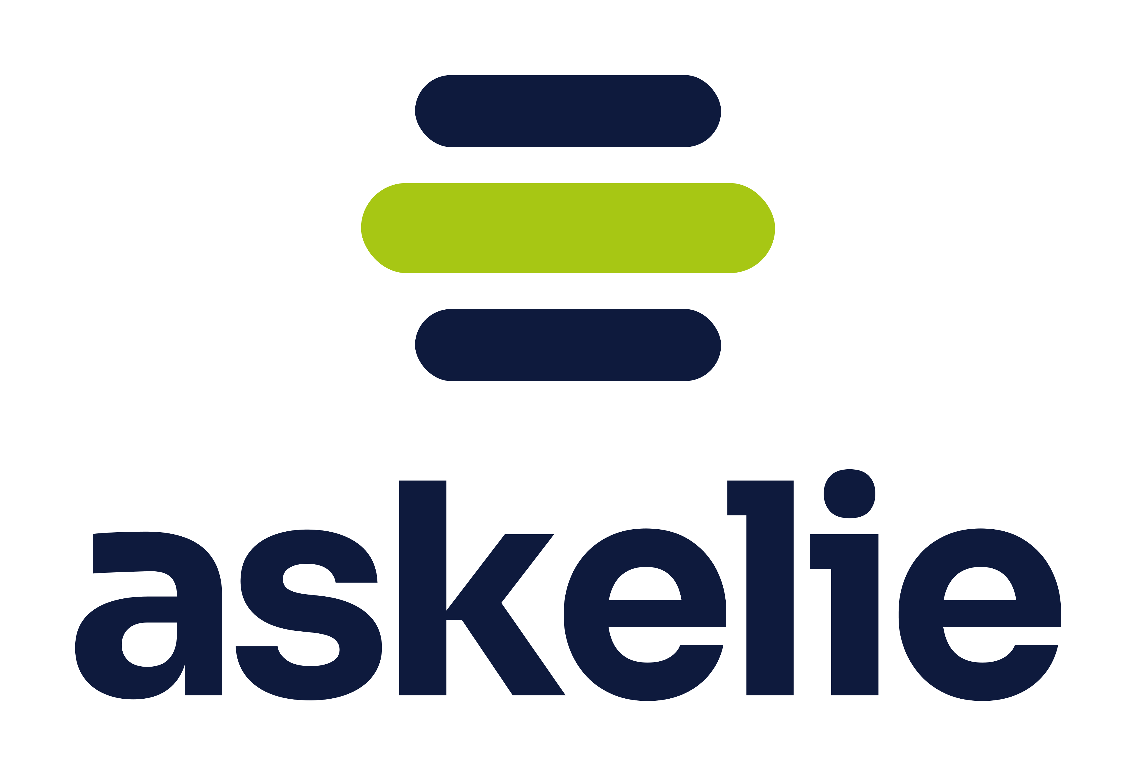


Meet the new askelie logo
Why we changed our logo
The askelie® logo has changed. We’ve grown a lot since we started, and it felt like the right time for our brand to move on with us.
Our previous logo, a friendly character wearing a headset, served us well in our early days. Since then, ELIE has grown into a full operational AI platform, and the askelie logo needed to grow with it.
We build ELIE, the Ever Learning Intelligent Engine. It’s an operational AI platform that connects the people in a business with the systems they already use, so that knowledge turns into action. We needed a logo that says that, clearly, at a glance.
How we got here
We didn’t want an askelie logo that simply looked modern. We wanted one that explained what we do, even to someone who had never heard of us.
So we started with the idea at the heart of our platform rather than with shapes and colours. We explored several directions, from speech bubbles that nodded to conversation, to loops that suggested continuous learning. Each had something going for it, but none captured the whole picture.
The breakthrough came when we stopped thinking about ELIE as a product and started thinking about it as a layer. The moment we drew it that way, the rest of the design followed. We then tested it hard: on light and dark backgrounds, on screens and in print, and at the tiny sizes used for app icons and browser tabs. It held up everywhere.
Three layers, one idea
The new askelie logo is three rounded layers, and each one stands for something real in every organisation.
- The top layer is people. The teams, the decisions and the questions that drive a business every day.
- The lime layer in the middle is ELIE. It sits between the two, connecting them so that information flows and work gets done.
- The bottom layer is systems. The data, documents and applications a business already runs on.
Most businesses have people on one side and systems on the other, with a lot of manual effort in between. Re-keying data, chasing documents, searching for answers. That gap in the middle is exactly where ELIE works, and it’s exactly where it sits in the logo.
Why the lime layer reaches further
Look closely at the askelie logo and you’ll see the lime layer is wider than the other two. That’s deliberate.
An operational layer can’t just serve one team or plug into one system. It has to reach across the whole business. So the lime layer stretches past the layers above and below it, on both sides.
It also makes an important point about how we work. ELIE doesn’t sit on top of a business, and it doesn’t replace what’s already there. It connects what a business already has and makes it work together. That’s why we describe askelie as The Operational AI Platform.
One colour, one meaning
The outer layers of the askelie logo are always neutral: dark on light backgrounds, white on dark ones. They stand for what a business already has, so they stay in the background.
Lime is the only colour in the askelie logo, and it belongs to ELIE alone. It’s the active part, the intelligence that’s always working. Wherever the logo appears, your eye goes straight to the layer in the middle.
The rounded ends matter too. They keep the mark approachable rather than corporate, because good technology should feel easy to work with.
Built to work everywhere
A logo has to work hard. It appears on websites and slides, in email signatures and on event screens, and sometimes as a tiny icon in a browser tab. The new askelie logo is made of simple, bold shapes, so it stays clear and recognisable at every size.
It works just as well on light backgrounds as on dark ones, and it has a one-colour version for the times when full colour isn’t possible. Alongside the mark, our name is set in Sora, a clean geometric typeface with open, friendly letters that echo the rounded layers of the logo.
What it means for our customers
For the organisations we work with, nothing about how we support them changes. What changes is how clearly we can explain the value we bring.
When we talk to a new customer, the askelie logo now does some of the explaining for us. Their people are one layer. Their systems are another. ELIE is what sits between them, taking the questions people ask and finding the answers in the data and documents they already have. It automates the work that used to be done by hand, and it keeps learning as it goes.
That’s the conversation we have in every first meeting. Now our logo starts it before we’ve said a word.
What it says about where we’re going
A logo is a promise in shorthand. The askelie logo now says what we actually do: we’re the layer in the middle that connects people and systems, and gets the work done.
You’ll see the new askelie logo rolling out across our website, products and materials over the coming weeks. The name stays the same, the team stays the same, and so does our focus on building AI that makes a real, practical difference to how organisations run.
We think it tells our story far better than a headset ever could. We hope you agree.

Comments are closed